Zappos Design Challenge
Design hybrid platforms for Zappos Coworking

Type
- Individual Work
- Interaction Design
Duration
- 7 days
My Role
- UX Designer
What I Did
- Comparative Analysis
- Product Design
Design Challenge
Design hybrid platforms for Zappos Coworking
As part of the interview for the UX Designer at Zappos, I was challenged to design hybrid platforms for 1) public-facing website and 2) internal management system that allows Zappos Co-working to serve information, make reservation, deal with payments and assets.
I was presented with the following assumptions:
- Pricing will be a flat daily rate with some pre-pay and group discounts
- Amenities available on Zappos campus (like snacks, cereal, drinks, etc.) are included for co-workers
- Power and Wi-Fi are included
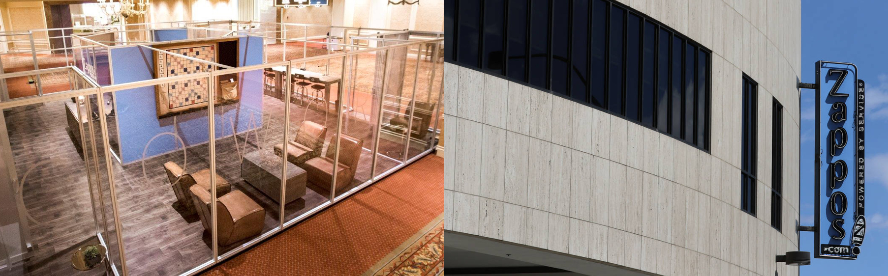
Zappos wants to open up some parts of its HQ as coworking spaces
Solution Overview
Focus on MVP
Zappos Co-working does not have infrastructure to manage its offerings. Namely, both platforms need to be built from scratch in a week. Hence, defining the MVPs is of great importance. The hybrid platforms focus on the the following features: 1) Serve information of different cowork spaces, 2) Make reservations on desktop and on-the-go, 3) Manage reservations, and 4) Decrease firction in space management.
Screens of the Zappos Coworking
User Journey
I defined the following features based on user journeys under an assumed user journey.
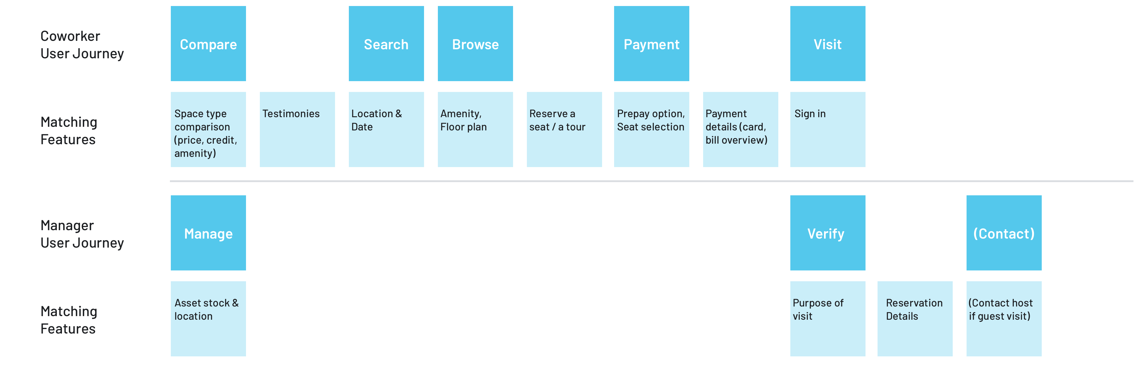
Persona
Users that would most benefited from the public-facing platform have the following characteristics:
Small Business Owner
- Limited time to search: One-person team overwhelmed by the amount of work every day
- Need to stay focused: Get easily distracted and fail to maintain work-life balance when working at home
- Small network: Look for partners to work with to expand business
Hacker Team
- Growing team: Need a larger place for work and meetings
- Increasing needs for guest-meetings: Most co-working space doesn’t allow guests
Managers of the Zappos Co-working space that would most benefited from the management platform have the following characteristics:
- Limited labor to manage the space: There’s no designated managers for the coworking space. The current managers are the receptionists
- Not familiar with all spaces: The Zappos campus is so big that it’s hard to have full understanding of the space usage and asset condition
User Needs
To understand the challenges that co-working space users and managers can be faced with in a broader sense, I looked into online discussions on co-workers’ reviews and potential competitors’ website to figure out current user pain points and management limitations.
Pain Point 1: No guests allowed
Longer lease is better for the use of space from the landlord’s point of view, in this case, Zappos Coworking. The same case stands for startup teams / small business owners. However, for startup teams / small businesses to expand, the coworking space needs to function like a normal office that not only serves as a place that they can get work done but help them grow – a big part of growth comes from investment and partnership. However, traditional coworking spaces doesn’t allow personal guests, who can be potential investors, stakeholders and so on.
Pain Point 2: Chairs / Furniture got moved around
Managing a coworking space can be hard –- coworker visits fluctuate and furniture gets moved around very often. To avoid desks without chairs, co-work space managers spend a lot of time matching chairs and desks.
Public-Facing Platform
Scenario 1
Serve Information
The Zappos Coworking site serves as the primary platform for space related information while the app serves to show coworkers about their reservation details or for search, browse and reserve on-the-go. In the space introduction, I highlight the credit that coworkers can use to invite guests to their space for meetings.
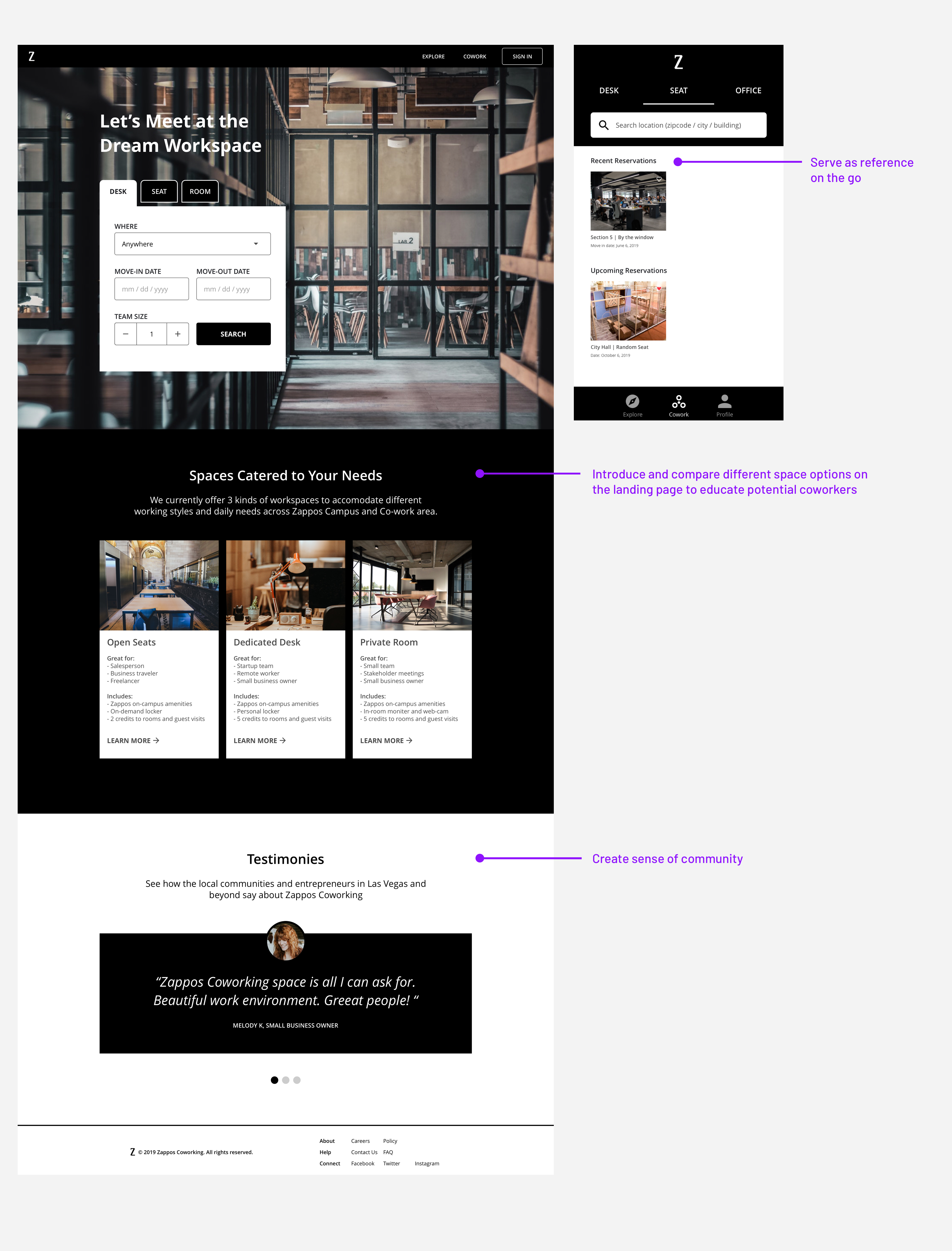
Assumption: Coworkers are most likely to learn about the coworking space via the site before they go ahead to download the app
Since Zappos Coworking space isn't limited to a single location, (or can further expand in the future), showing where the coworking space is located is imperative to the accessibility of the Coworking space. As coworkers spend less time on finding a space to work either on the go or beforehand, they can spend their energy on what really matters to them.
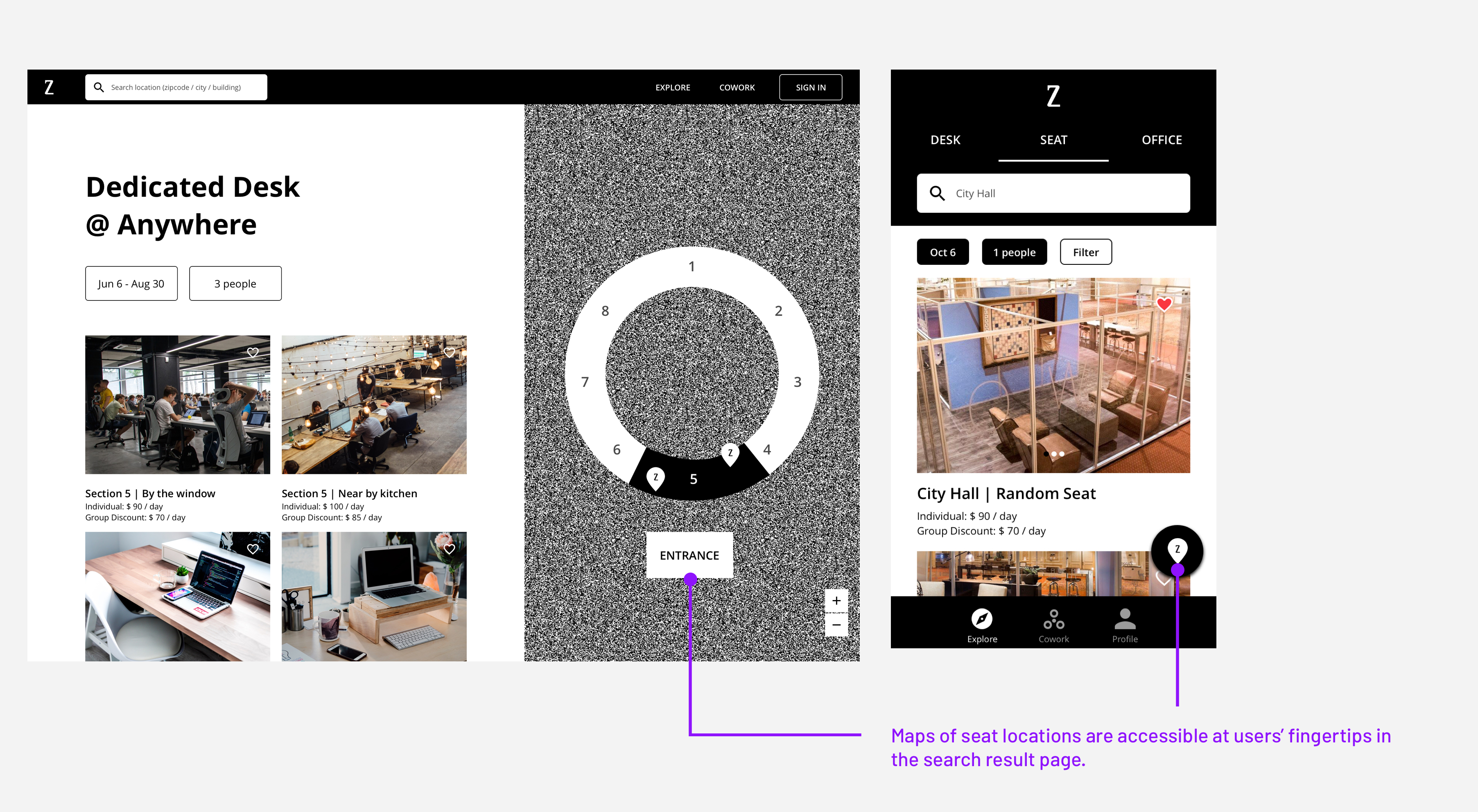
Screens of search results on the site (left) and in the app (right)
Scenario 2
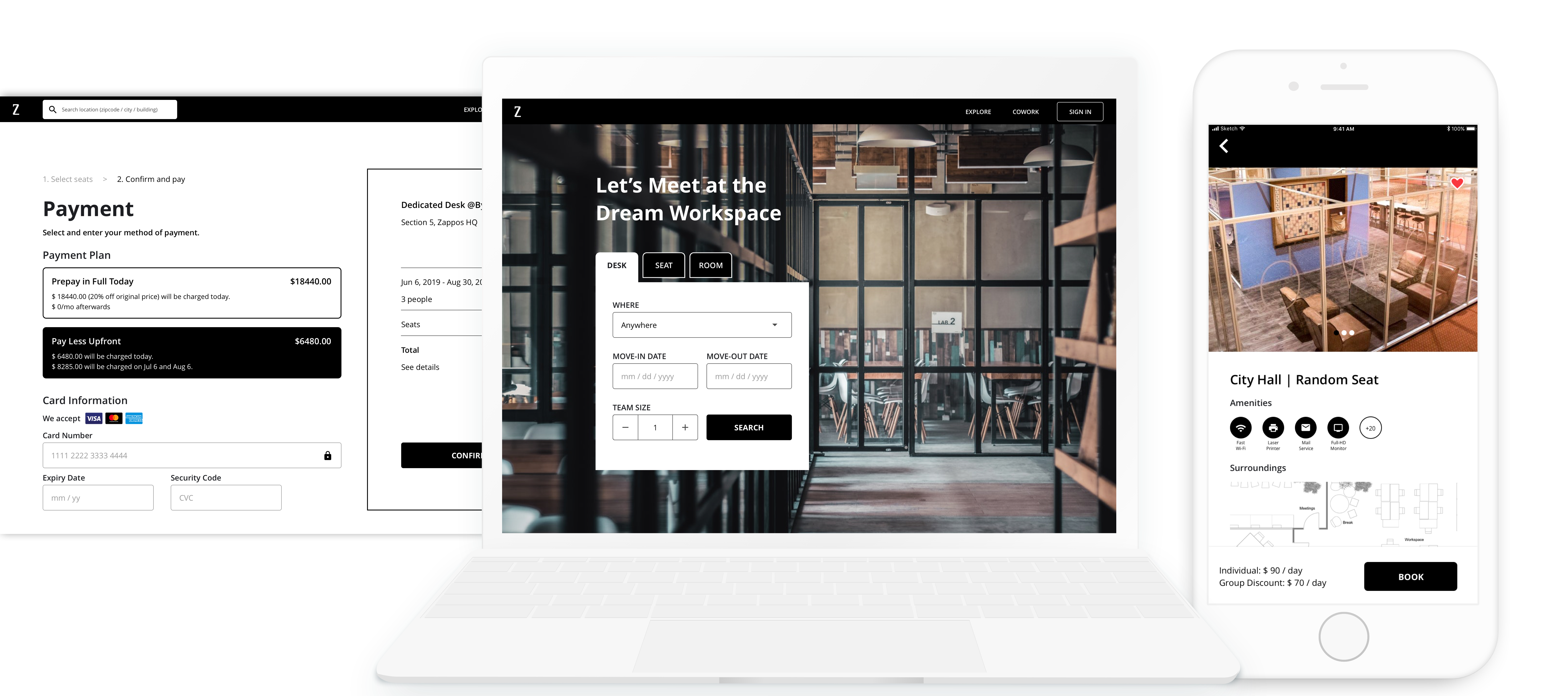
Make reservation & payment
After the coworker has decided on a space to reserve, he can either reserve the space or book a visit. For designated desk, the coworker would be asked to choose a seat he likes before proceeding to payment. Under payment, he can opt to prepay in full to enjoy a discount or pay in installment.
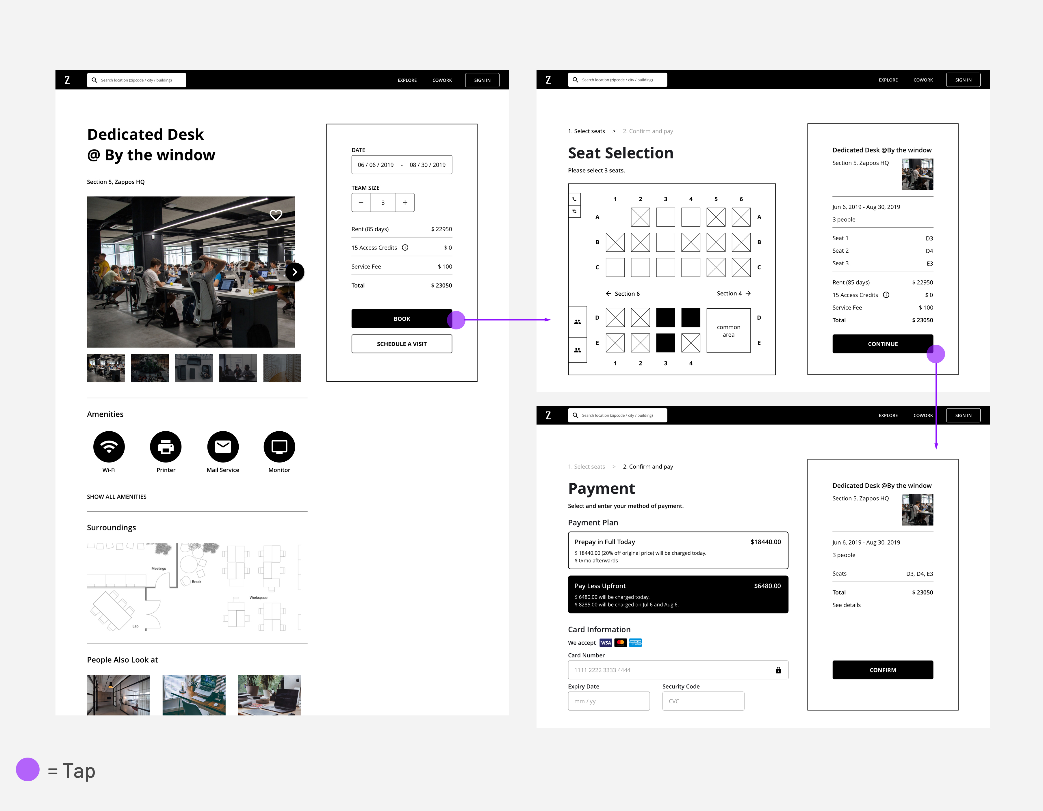
Booking and payment flow on the website
For booking on an app, I assume that the coworker is booking a temporary seat on-the-go. She has previous experience of using the Zappos Coworking service, so it would save her some time during the checkout. However, if she didn't link her card information to her account, the app will direct her to do so. After the spot is reserved, the page will show her date and seat information.
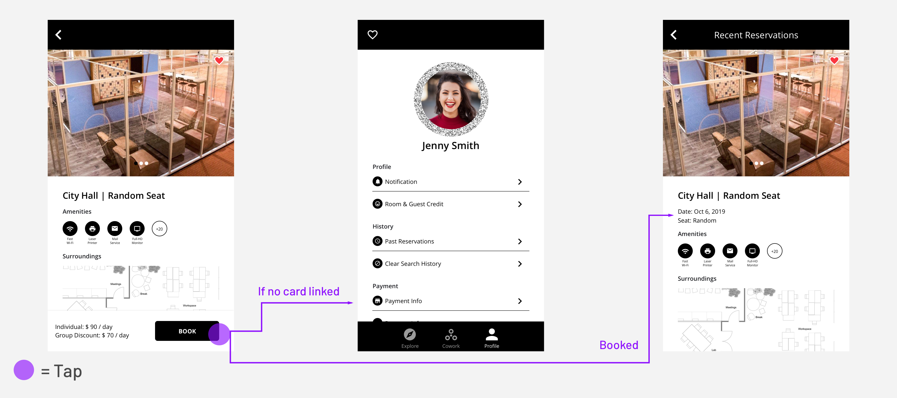
Booking and payment flow on the app
Internal Management Tool
Scenario 1
Check in
Jenny can check in at the City Hall reception desk using the unique QR code in her profile page. As she scans her profile, the cowork space manager would be able to match Jenny's face with her reservation details in the system.
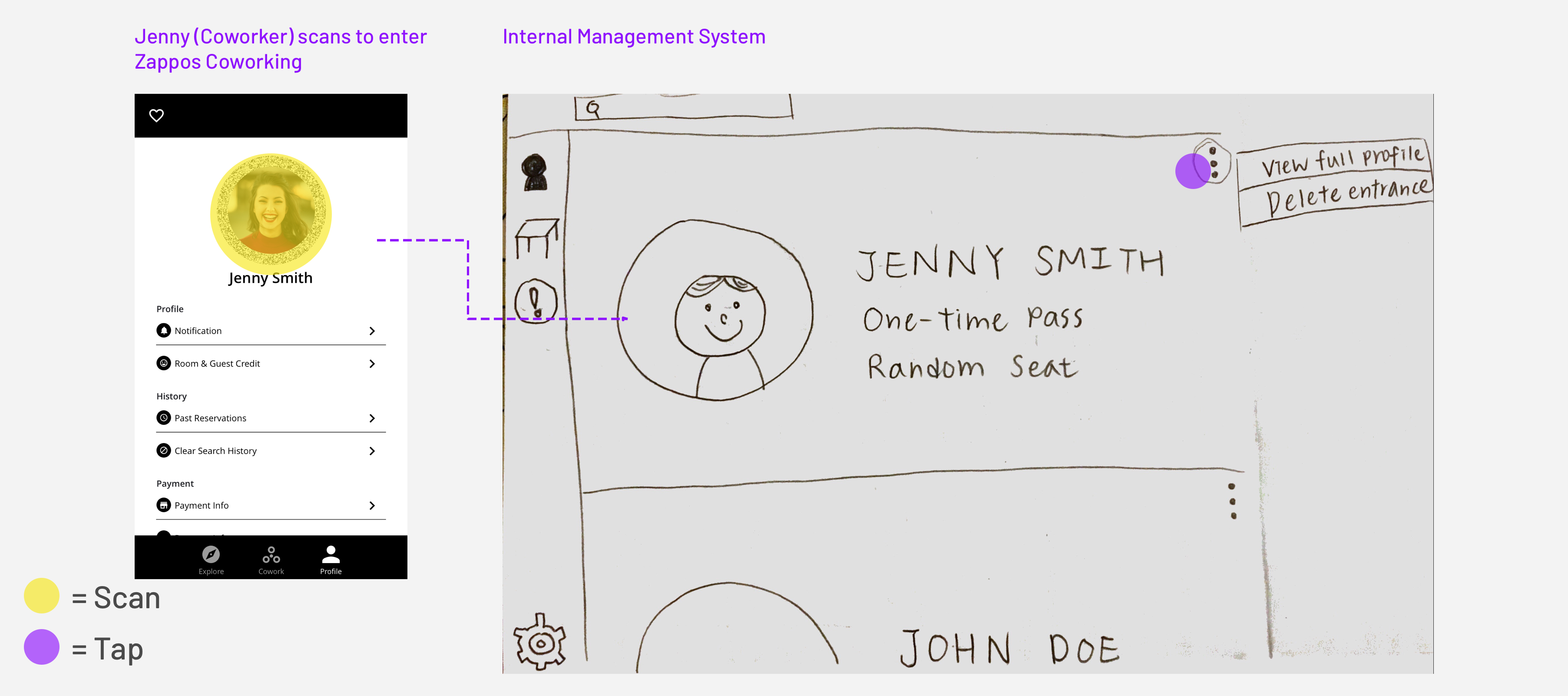
Check-in flow: Interaction between coworker app and management tool
Scenario 2
Manage assets / furniture
To ease the pain that site managers are suffering from due to furniture misplacement, the management app also incorporates furniture location features, shortening the time on matching chairs and desks.
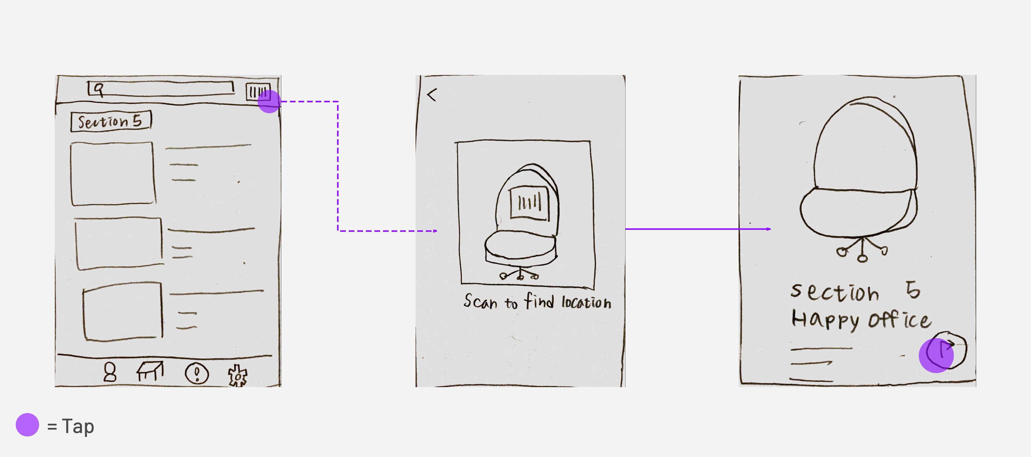
Site managers can use phone camera to scan the bar code attached to the chair to find out details about it and its location information
Takeaways & Next Steps
This is one of the most challenging design challenge I've ever taken on. It's difficult because the scope of the challenge itself is big and there are a lot of requirements to meet in 7 days, which further stresses the importance of prioritization. When I began working on the proejct, I spent most of my time framing a detailed user journey without taking the possible interaction between coworkers and managers into account to define the key interactions. Hence, instead of narrowing down the scope, I got stuck due to the complexity of the whole system. If I could work on the challenge again, I'd focus on one major part of the interaction. This way, even though the system might not be as thorough as what I created now, at least it would be a more well-thoughtout interaction with potential to expand.